
Contents
- 1
- 1.1 Why most brand style guides fail
- 1.2 What actually belongs in a usable style guide
- 1.3 A before-and-after example
- 1.4 A step-by-step process for building one
- 1.5 Style guides and AI design agents
- 1.6 What format should your style guide actually live in
- 1.7 How to test whether your style guide is actually working
- 1.8 Common mistakes when building a style guide
- 1.9 Who should actually own the style guide
- 1.10 How is this different from a full brand book?
- 1.11 Frequently Asked Questions
- 1.11.1 How long should a brand style guide be?
- 1.11.2 Who should be responsible for maintaining a brand style guide?
- 1.11.3 Does a style guide need to include brand voice and messaging, not just visuals?
- 1.11.4 How often should a brand style guide be updated?
- 1.11.5 What tools should I use to build a brand style guide?
- 1.11.6 Can a small team or solo brand really benefit from a formal style guide?
- 1.12 Conclusion
By Shreya Jhawar
The best brand style guide is the one your team actually opens before starting a new asset, not the one that sits in a shared drive collecting dust. We’ve built and rebuilt style guides for small studios and solo brands enough times to know the failure mode by heart: a beautiful 40-page PDF that nobody references after week one, because it was designed to look impressive in a pitch, not to be used at 4pm on a Friday when someone needs a quick answer about which blue to use.
A style guide that actually gets used is short, specific, and answers the questions people ask most — not the questions a designer finds most interesting to document. That distinction sounds obvious once stated, but almost every unused style guide we’ve inherited from a client made the opposite choice, favoring completeness over daily usefulness.
This matters more than it might seem for the day-to-day economics of running a small studio, a solo brand, or an in-house marketing function with limited design bandwidth. Every minute spent guessing at a brand decision — or worse, shipping something off-brand because nobody checked — is a cost that compounds across every asset a team produces. A style guide that’s actually used pays that cost once, at creation, instead of over and over across every future request.
Why most brand style guides fail
Most style guides are built backwards. Someone spends a week compiling every possible brand asset — every logo lockup, every color tint, every typographic pairing — into a comprehensive document, and then wonders why nobody on the team actually references it. The problem isn’t thoroughness. It’s that thoroughness and usability are different goals, and most guides optimize for the wrong one.
Here’s the actual test of a good brand style guide: can a new hire, a freelancer, or an AI design agent open it and immediately know what to do, without needing to ask a follow-up question? If the answer requires flipping through a 40-page PDF to find a hex code buried on page 23, the guide has failed at its actual job, regardless of how polished it looks.
The second failure mode is treating a style guide as a one-time deliverable instead of a living reference. Brands evolve — a new product line, a shift in audience, a rebrand of a single sub-element — and a style guide that isn’t updated becomes actively misleading within a year. Teams then either follow an outdated guide (producing off-brand-feeling-current work) or ignore it entirely (producing inconsistent work). Neither outcome is acceptable, and both are avoidable.
A third, quieter failure mode is scope creep during the guide’s creation. What starts as “let’s document our colors and type” gradually expands to include tone-of-voice frameworks, social media templates, email signature formats, and a dozen other adjacent decisions — each reasonable on its own, but together they turn a one-page reference into a sprawling document nobody finishes reading. The fix isn’t refusing to document those things; it’s keeping them in separate, equally tight references rather than merging everything into one guide that tries to do too much.
What actually belongs in a usable style guide
A style guide that gets used contains far less than most people assume it needs. Here’s what we’ve found is actually necessary, and nothing more:
1. Three brand adjectives, defined by example
Don’t just write “modern, trustworthy, approachable.” Everyone writes that. Instead, pair each adjective with a concrete example: “Modern means we use generous whitespace and avoid decorative flourishes — see [example]. Trustworthy means our copy states facts plainly instead of using superlatives.” Adjectives without examples are decoration; adjectives with examples are usable instructions.
2. A five-color palette, with usage rules attached
List your colors with hex codes, but more importantly, attach a rule to each one: which color is primary (used most), which is the single accent (used sparingly, for emphasis only), and which combinations are explicitly forbidden. A palette without usage rules just tells people what colors exist — it doesn’t tell them how to use them, which is the part that actually prevents inconsistency.
3. Two typefaces, with a clear hierarchy rule
One display typeface for headlines, one body typeface for everything else, and a simple rule for when each gets used. Resist the temptation to include a third “accent” typeface for special occasions — that’s almost always where brand consistency starts to erode, because “special occasions” get defined differently by everyone on the team.
4. Logo usage rules, framed as “never do this”
Positive usage examples are useful, but the highest-leverage content in this section is a short list of common mistakes: don’t stretch the logo, don’t place it on a busy background, don’t recreate it in a different typeface. People are far more likely to remember and follow a short “never do this” list than a long list of positive guidelines.
Include minimum clear-space rules and a minimum size for legibility, but keep both to a single sentence each. “Leave clear space equal to the height of the logomark on all sides” is a usable rule. A diagram with six different clear-space measurements for six different contexts is not — it’s the kind of detail that looks thorough in a PDF and gets ignored in practice, because nobody has time to measure clear space against a six-variable chart before shipping a social post.
5. Two or three annotated real examples
Take actual pieces of past work — a social post, a slide, a one-pager — and annotate them with why specific decisions were made. This is the section that turns an abstract style guide into something a new team member or an AI design agent can actually pattern-match against, because it shows the system being applied to a real deliverable instead of describing it in the abstract.
A before-and-after example
Here’s the difference between a vague style guide entry and a usable one, for the same brand element — an accent color.
Vague version: “Terracotta — use as an accent color to add warmth to the palette.”
Usable version: “Terracotta (#C46A4E) — our single accent color. Use it for one element per layout maximum: a call-to-action button, a single highlighted stat, or a section divider. Never use it as a background behind body text — it fails our minimum contrast requirement at that pairing. Never use two terracotta elements in the same layout; if you need a second point of emphasis, use bold weight on our body typeface instead.”
The vague version tells you the color exists. The usable version tells you exactly when to reach for it, when not to, and what to do instead when you’re tempted to overuse it — which is the actual decision people need help with in the moment they’re building something.
A step-by-step process for building one
- Audit your last ten pieces of design output. Before writing anything new, look at what you’ve actually shipped. The patterns that appear consistently across those ten pieces are your real brand system — codify those, rather than inventing a system from scratch that doesn’t match what you’ve actually been doing.
- Write the three brand adjectives with examples first. This section anchors everything else, so get it right before moving to colors and type.
- Document the five-color palette with usage rules, not just hex codes. If you don’t have usage rules yet, write them now — it’s the single highest-leverage addition to any color palette section.
- Choose two typefaces and write the hierarchy rule in one sentence. If you can’t state it in one sentence, the rule isn’t clear enough yet.
- Write the logo “never do this” list from memory. You already know the mistakes people make with your logo — you’ve seen them. Write those down before you write the positive usage guidelines.
- Annotate two or three real examples. Pick pieces that represent your brand well, and write one sentence per major decision explaining why it was made.
- Put the whole thing on one page, or as close to one page as possible. If it doesn’t fit on one page, the guide is documenting too much. Cut before you add.
- Revisit it after every major brand decision. A style guide isn’t finished — it’s maintained. Treat updates to it the same way you’d treat updates to any other piece of infrastructure your team depends on.
Style guides and AI design agents
A tight, usable brand style guide has become more valuable, not less, now that AI design agents are part of many teams’ workflows. We’ve written before about how to brief an AI design agent, and the single biggest lever for getting consistent output from one is exactly the kind of half-page, example-anchored style guide described here — not a comprehensive 40-page brand book. AI agents drift toward generic output when they don’t have real constraints to push against, and a short, specific style guide is the tightest constraint you can hand one.
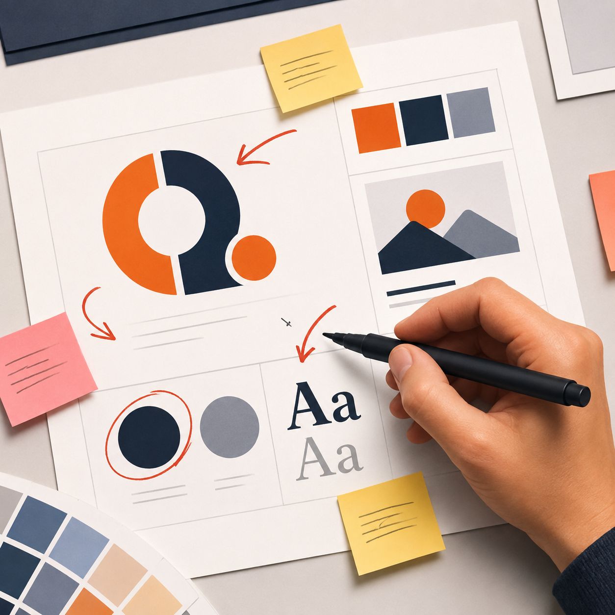
This is also why the “one page” rule matters more than it might seem. A style guide you can paste directly into a brief — colors, type, logo rules, one annotated example — is immediately reusable across every AI-assisted design request your team makes, the same way it should already be reusable for every human designer or freelancer who joins a project.
According to Adobe’s 2024 creative trends research, brand consistency remains one of the biggest gaps between AI-generated creative work and genuinely usable output — and that gap closes fastest when the brand system feeding the tool is actually clear enough for a human to follow too.
The same logic extends to briefing an AI design agent for marketing assets specifically — a landing page hero image, a paid ad set, a launch email header. In every case, the agent (or the freelancer, or the new hire) is only as consistent as the constraints you hand it, and a one-page style guide with real usage rules is the single artifact that makes every one of those requests faster and more on-brand than the last.
What format should your style guide actually live in
The format matters less than the length, but a few practical notes save real friction:
- A single Figma or design-tool page works well if your team is already living in that tool daily — the style guide sits right next to the work, and updating a color swatch updates the reference simultaneously.
- A shared Notion or Google Doc page works better for teams that mix design and non-design roles, since anyone can open it without a design-tool license.
- A static PDF is the weakest option despite being the most common — it’s the hardest to update, and an out-of-date PDF is worse than no style guide at all, because people trust it by default.
Whichever format you choose, the deciding factor is update friction: pick whatever your team will actually keep current, not whatever looks most polished on day one.
How to test whether your style guide is actually working
A style guide’s real test isn’t how it looks — it’s whether it changes behavior. Here’s a simple way to check:
- Ask three team members where the style guide lives. If more than one doesn’t know, the guide has a discoverability problem, not a content problem — fix that before adding more detail.
- Pull the last five assets your team shipped and check them against the guide. Consistent color usage, consistent logo clear space, consistent typographic hierarchy — if two or more of the five deviate noticeably, the guide either isn’t specific enough or isn’t actually being referenced.
- Hand the guide to someone unfamiliar with the brand and ask them to describe it back to you. If they can’t summarize the three brand adjectives and the core color/type rules after one read, the guide is too long or too vague.
- Time how long it takes to find a specific answer — “what’s our accent color’s hex code,” for instance. If it takes more than a few seconds, the guide’s organization needs work regardless of its content quality.
Common mistakes when building a style guide
- Documenting everything instead of the decisions that repeat. A style guide should cover the choices your team makes over and over, not every conceivable edge case.
- Treating it as a design deliverable instead of an internal tool. A style guide’s audience is your own team, not a client or an award submission — design it for daily reference, not for looking impressive once.
- Skipping the “never do this” sections. Positive guidelines alone don’t prevent the most common mistakes; explicit anti-patterns do.
- Never updating it after the initial version. A style guide that doesn’t reflect your current brand is worse than no style guide, because it actively misleads anyone who follows it.
- Making it too long to actually reference. If your team has to search through pages to find an answer, they’ll stop looking and just guess — which is the exact outcome a style guide exists to prevent.
- Building it in isolation from the people who’ll use it. A style guide written by one person without input from whoever actually produces daily design and marketing output tends to document an idealized brand system rather than the practical one people need. Involve at least one person who isn’t the guide’s author before calling it final.
Who should actually own the style guide
Ownership matters as much as content. A style guide with no clear owner drifts out of date the moment the person who wrote it moves on to other work — updates stop happening because nobody feels responsible for making them. The healthiest setup we’ve seen, especially for small teams and solo brands, is a single named owner (often whoever owns brand and design decisions generally) who is explicitly responsible for two things: approving any change to the guide, and reviewing it at least once per quarter even if nothing seems to have changed. That second habit catches the slow drift that happens when small decisions accumulate without ever getting written down — a slightly different blue used “just this once” three times becomes a fourth, undocumented brand color if nobody’s checking.
How is this different from a full brand book?
A brand book documents everything about a brand’s identity — voice, mission, positioning, full visual system — and is often built for external audiences like investors or partners. A style guide, in the sense described here, is a working internal tool built for the people actually producing design and marketing assets day to day. Both can coexist, but conflating them is a common reason style guides become too long to be useful: teams try to make one document serve both purposes, and it ends up serving neither well.
Frequently Asked Questions
How long should a brand style guide be?
Ideally one page, or as close to it as your brand system allows. If your team needs more than a page to reference day-to-day decisions, the guide is likely documenting too much detail rather than too little.
Who should be responsible for maintaining a brand style guide?
Whoever owns brand decisions day to day — often a solo designer, a small studio’s lead, or a founder in earlier-stage companies. The key is that one person is responsible for updates, so the guide doesn’t drift out of sync with actual brand decisions over time.
Does a style guide need to include brand voice and messaging, not just visuals?
It can, but keep it just as tight as the visual sections — three or four voice principles with real examples, not a full messaging framework. If voice and messaging require more depth, that likely belongs in a separate document rather than bloating the visual style guide.
How often should a brand style guide be updated?
Whenever a real brand decision changes — a new primary color, a typeface swap, a new product line with its own visual needs. There’s no fixed schedule; the guide should be a living reflection of current brand decisions, updated as those decisions happen rather than on an annual cycle.
What tools should I use to build a brand style guide?
Whatever tool your team already works in daily — a Figma page, a Notion doc, or a shared Google Doc all work fine. The tool matters far less than keeping the guide short and current; a beautifully designed PDF that never gets updated is worse than a plain text document that does.
Can a small team or solo brand really benefit from a formal style guide?
Yes, arguably more than a large team — a solo designer, marketer, or brand owner is the one person enforcing consistency across every asset, and a one-page reference makes that job dramatically faster than relying on memory alone, especially once AI design agents are handling some of that output.
Conclusion
A brand style guide earns its place in your workflow by being useful at 4pm on a Friday when someone needs a fast, specific answer — not by being comprehensive enough to impress in a pitch deck. Keep it to three brand adjectives with examples, a five-color palette with usage rules, two typefaces with a clear hierarchy, explicit logo “never do this” rules, and two or three annotated real examples, and you’ll have a document your team — human or AI — actually opens before starting new work.
Start smaller than feels sufficient, put it somewhere your team already looks, and treat every update to it as routine maintenance rather than a special project. That’s the whole difference between a style guide that shapes daily work and one that only ever shaped a single pitch deck.